Leadline 1994: Colour and Light: Image and Emanation (Part One)
 by Jason Peter Brown on July 20, 2007
 Filed Under: REPRINTINGS, LEADLINE, STAINED GLASS, ART
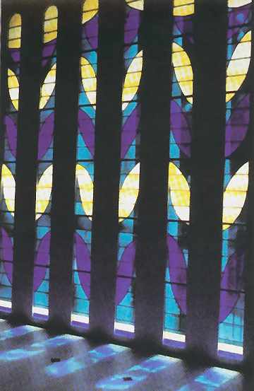
Henri Matisse, Chapelle du Rosaire, Vence, France, 1951.
This editorial was written by Doreen Balabanoff, and originally appeared in Leadline in 1994. Part one of six.
Colour and light: image and emanation… the theme of this issue arose out of my own growing awareness of the relative silence which has hung over the subject of colour in this medium for some time. How ironic, I thought, when so many glass artists are drawn to the medium through their love of colour… Yet it seems that colour (and its mother Light) have been relegated to the 'not to be mentioned much' pile. Perhaps we think of it as too simple or 'obvious' to merit discourse. Perhaps, as Ted Goodden suggests, we just don't have words. Maybe we still believe in the outmoded notion that we betray a lack of sophistication when we express our love of the brilliant, jewel-like magic of colour-as-light. It is, no doubt, much more 'of the times' to love black and white.
But we live in an age when colour, in every form, is available to us as never before. And though such dramatic increases in exposure don't necessarily lead to increased sensitivity, we might hope for an eventual heightening of our awareness and understanding of colour and its various dynamics.
Artists and critics could help the viewers (and makers) of art to grow in their awareness of colour issues by including colour more often in their discussions. Stained glass artists (and the few available critics who know enough to discuss the medium seriously) could have something to offer here. For though most glass artists do use colour intuitively, when pressed, they often can articulate a personal approach to colour which underpins their oeuvre; and analysis of this sort often yields interesting insight.
For example, when Maud Cotter describes deep blue and ruby red as opposites, a literal mind argues that these hues are not complementaries. But a thoughtful analysis brings the awareness that they are, in fact, at opposite ends of the visible spectrum — red at the long wave end, blue at the short wave end, moving toward ultraviolet. This seems a marvellous way of understanding their opposition - and the peculiar alchemical power they seem to exert over us.
This issue of the Leadline hopes to transcend the limits of its own title, and to focus attention on the topic of colour … to break open the topic, at least… It cannot presume to do much more in a few short pages. Hopefully it will offer an inspiring look at colour as an aspect of this medium which can and should be an intelligent, articulate and passionate pursuit.
Over the past 20 years, the world of contemporary stained glass has been dominated (internationally) by a resolutely linear sensibility. In 1976, Ludwig Schaffrath (one of the best known post-war German glass designers), lecturing in London, England, pointed out the overuse and abuse of colour in contemporary culture, and called for a respite from colour bombardment. Schaffrath's own works, many executed in clear and white glass only, spoke eloquently of a new, even revolutionary, way of seeing the stained glass window. While eliminating most colour, they focused attention on the more 'graphic' possibilities of the medium: the reinvention of the leadline as a powerful drawn line, the use of 'opal' and 'opak' glass to increase the readability of that line, and a 'structural' architectural sensibility (as if the skin of the building had been peeled back to reveal its sinews, represented in glass and lead). Schaffrath and other German artists in the field, widely emulated across the globe, brought to the fore issues of drawn line, architectural relationship and graphic device.
Continued in Part Two.