Leadline 1994: Colour and Light: Image and Emanation (Part Four)
 by Jason Peter Brown on July 24, 2007
 Filed Under: REPRINTINGS, LEADLINE, STAINED GLASS, ART
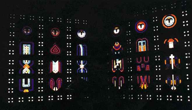
Nicolas Kazis, architect, Church of St Remy, Baccarat, France.
This editorial was written by Doreen Balabanoff, and originally appeared in Leadline in 1994. Part four of six. You can read Part One here.
In addition to the photographic limitations, financial ones always come into play when colour reproduction is desired. For this reason, work in glass is often seen reproduced in black and white, and the implications of this are quite significant. For what is visually exciting and dynamic in colour is not necessarily so in black and white 'translation' where only value contrast remains operative. Then, too, many colourists are exploring ideas unrelated to 'excitement' or 'dynamism'; sensitive colour work is completely obliterated by black and white (or poor colour) reproduction.
In Museum Without Walls (1953) Andre Malraux wrote of the impact which black-and-white photography has had upon our understanding of art:
"For the last hundred years… art history has been the history of that which can be photographed… No man of culture can have failed to be impressed by the unbroken continuity, the inevitability, of the course of Western sculpture, from Romanesque… to Baroque. But how few cultured persons are aware of the parallel evolution of the stained glass window, or the drastic transformation that took place in Byzantine painting…
The impression that Byzantine art was repetitive and static prevailed so long because its drawing was bound up with convention - whereas its life force, genius and discoveries were recorded in colour."
"Indeed", said Malraux, "a reproduction used to be thought the more effective because the colour was subordinated to the drawing."
And yet colour has moved into a predominant role in the art of the past 100 years. The English Romantic critic John Ruskin asserted in 1853 (on the threshold of a colour revolution beginning to sweep through the world of painting):
"No amount of expression or invention can redeem an ill-coloured picture; while on the other hand, if the colour be right, there is nothing that it will not raise or redeem; and therefore wherever colour enters at all, anything may be sacrificed to it… so that when an artist touches colour, it is the same thing as when a poet takes up a musical instrument; he implies, in so doing, that he is a master… of that instrument, and can produce sweet sound from it… which if he be not able to do, he had better not have touched it… I only wish that it were better understood that all expression, and grouping, and conceiving, and what else goes to constitute design, are of less importance than colour, in a coloured work."
19th and 20th c. painters raised colour consciousness to the point where colour became the subject matter. And colour process printing has changed the world of art history since Malraux's time.
At the same time, in writings on stained glass, it has become traditional to blame 'painters' for the demise of the medium. One senses here the antipainterly bias which the German architectural school of glass fostered - a sensibility most blatantly seen in R. Kehlman's recent volume, 20th Century Stained Glass, A new definition, where Kehlman's hostility toward the painterly approach to glass is tantamount to a denial of its existence as a viable approach. Certainly, from the 15th century onwards, the influence of oil painting did gradually erode the architectural, structural and colouristic strengths of the medium, moving it towards a sort of illuminated painting in which leadlines were undesirable and light was to be held to a soft glow.
And yet, ironically enough, the recovery of colour and light as dynamic aspects of the medium has been due, in large part, to the efforts of 20th c. painters and architects. In the 19th century, pre-modern Gothic revivalists like Ruskin in Britain and architect Viollet LeDuc in France sought to understand the optical mysteries of medieval glaziers' colour use, just as scientists like Helmholtz, Maxwell, Chevreul and Rood were attempting to unravel the complexities of colour related to human perceptual faculties. Art Nouveau artists and architects (Clarke, MacIntosh, Horta, Guimard, Gaudi, Tiffany, to name only a few) experimented with glass as an architectural design element, and in some cases explored its richly emotive colour capacity.