Leadline 1994: Colour and Light: Image and Emanation (Part Six)
 by Jason Peter Brown on July 30, 2007
 Filed Under: REPRINTINGS, LEADLINE, STAINED GLASS, ART
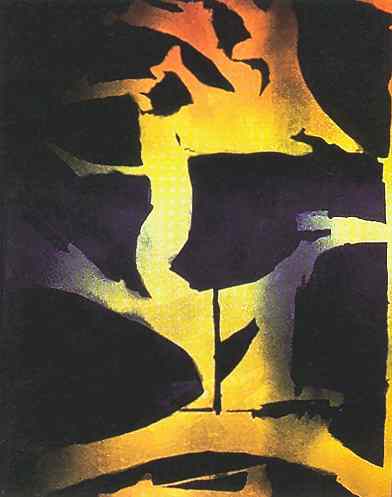
Yoshiro Ohyama "Reflections" 1993
This editorial was written by Doreen Balabanoff, and originally appeared in Leadline in 1994. Part six of six. You can read Part One here.
Manessier's eight windows for the crypt of the Münsterkirche in Essen left no doubt about it - they were an exercise in the sheer sensual and spiritual power of rich colour - coloured light was not the vehicle, but the whole point. Chagall's blue windows in the apse at Reims, pulling the visitor from the entry doors to the far end of the cathedral with their profound and magnetic glow, are typical of his works in the medium, which have often been criticized for the insensitive leadlines which were superimposed on them by his production collaborator, but are rarely praised for the wonderful atmospheric colour fields that they are. In Légèr's windows at Audincourt and Courfaivre, colour seemed to cut loose from the tradition of the leadline; it appeared unharnessed to structure, as if floating on a white field, no longer predictable. Matisse's Chapelle du Rosaire at Vence stands out as arguably the most compelling and comprehensive architectural work in stained glass of this century, putting all of the best qualities of the medium into full play.
In Germany, too, before the Second World War, contemporary painters had experimented with glass. The Bauhaus had an active stained glass workshop run by Albers and Klee for several years. Albers' own well-known work in colour began in the medium of glass, and continued for over ten years exclusively in this medium, until his move to America in 1933.
The seeds that were sown by these artists have not been lost on a new generation of artists. As 20th century art moved past traditional 2 and 3-D formats, stained glass too moved into new territories. Many new technologies and materials have constantly expanded the creative possibilities available to glass artists. Works are being produced which explore the many environmental or sculptural/conceptual properties of glass. The term stained glass is itself used with some discomfort, as artists push past the traditional means and methods of the medium.
Now, we might hope that contemporary glass artists could be capable of including colour in our discussions unapologetically, even knowledgeably. In fact, there are so many elements of colour study which are pertinent to the stained glass artist that the lack of attention to it is somewhat astonishing. Issues of colour dynamics (such as simultaneous contrast, optical mixing, etc…) are no doubt more potent in the luminous visual field of the window than on the reflective surface of canvas or paper. The mixing of coloured light (in space/onto surfaces) operates on a completely different principle (additive) that the mixing of coloured pigments or layering of films (subtractive). Certainly an increased knowledge of these phenomena would benefit our use of colour in the physical environment.
The physiological and/or psychological impact of coloured light is undeniable. Shouldn't stained glass artists take an interest in these issues when producing work for a hospital, a church, a home or a workplace? Shouldn't we be aware, for example, that red light affects our sympathetic nervous system, and can raise blood pressure, or alter our perception of the physical temperature of a room? That blue light affects our parasympathetic system, and has opposite effects on our body? And too, that these effects will actually reverse after prolonged exposure to the same colour stimulation, if unbroken by other colours? How much have we exposed ourselves to the vast body of literature on colour now available, most of it published within the last thirty years? How much have we contributed to it?
Of course, colour use, if it is to be more than an academic exercise, must be connected to a love of colour, manifested in a personally resonating colour sense. For some, colour is analytical, systematic, related to ideas about order and rationality, for others it is intuitive, emotive, associative or symbolic. But without a doubt the best work in colour delves into a personal alchemy to achieve a sense of profundity irrespective of style or approach.
On the following pages in the colour portfolio, I have chosen to present the works of 16 artists whose works, I believe, derive from strong, personal colour sensibilities. The images on these pages, I hope, provide some insight into the diversity of approach which can be found in artistic colour use.
To be sure, colour and light are not factual, ultimately knowable phenomena. Due to their complexity, ephemerality, and connection to the deeper aspects of our being, we will not exhaust the mysteries they contain in a hurry. And as artists, empirical study is not our ultimate aim. As Albers said of his own colour pedagogy, "… knowledge and its application is not our aim; instead it is flexible imagination, discovery, invention… taste."
This concludes the editorial.